Monday, August 22, 2011

Pokemon

I love Pokemon.

I started playing the Blue version way back in Primary School.I remember skipping meals just to save up money to buy a Gameboy Pocket and the game cartridge. While I did not manage to catch 'em all, I had a lot of fun battling with my friends, with most battles ending in a classic final showdown between Mewtwo and Mewtwo. I did play all the subsequent versions, but the original generation of Red Blue and Yellow holds a special place in my heart.

When I saw this Zelda collage that was created to commemorate the 25th anniversary of that series, I was blown away. This is a piece of Zelda fanart that can end all Zelda fanarts. The sheer amount of details that are crafted into this super awesome artwork is staggering. I can really tell that the artist is an avid fan of the series.

Thus, when my digital painting lecturer called for a personal project as our final assignment, I immediately jumped onto the idea of creating a Pokemon fanart that tries to emulate the epic-ness of the Zelda collage. Multi-figure composition is also another field of study that I hope to explore in. I have always found difficulty trying to portray multiple characters within the same space of the painting, and I was hoping to learn a thing or two when constructing this piece of fanart.

I had several ideas of how the collage piece can look. The original one was to place the characters in a fashion similar to that of the Sistine Chapel ceiling. I remember reading about the Zelda Collage on Kotaku, and one reader commented that if there was a St. Peter's for games, that collage would definitely be on the Sistine Chapel. I played around with the idea a little, but realized that the characters and scenes are too separated, which goes against my multi-figure learning objectives.

The sketch is so rough, that you probably can't tell what's going on
I then proceed to experiment with placing characters like how a Marvel comic book cover would. In this way, I was able to divide and break out the page into individual episodes where I can place different groups of characters together. I settled on this idea, with the page consisting of the gym leaders at the left, elite 4 at the top, team rocket at the right and Ash Ketchum in the center.


I usually start a piece of artwork with very loose and sketching lines. Very often, the only person who knows what is going on in these thumbnails is myself, therefore I rarely, if ever, show these to anyone.


I then go on to refine the drawing until it is the viewer can recognize each character just by the lineart. This is the phase where I try to get all the problem solving done. It is always very difficult to try to correct drawing errors during the painting stage, so I try to minimize that by doing a very clean sketch.


Next, I do a quick color test, slapping in tones to suggest the where the lighting is coming from. I switch back and forth constantly between color and grayscale to check on the tonal values. I also keep another window of the artwork, displaying at a smaller resolution, at the side of the screen to make sure that the entire composition reads. This is important as there are many characters present here, and I want to make sure that Ash is always the center of attention.

And finally, the finished piece
This piece took me more than 40 hours from conception to final realization. While it did not turn out nearly as epic as I would have imagines, I am still quite happy with the results. Next time: All 600+ Pokemons!

The Sacrifice, a Post-Moterm

'The Sacrifice' is the animation created for the final assignment for my projects class. It was a collaborative effort of the entire class - all 7 of us. I am honored to by appointed the director for this project. As this is my first time taking up such a role, I've decided to write a brief post-moterm, chronicling the successes and failures.

What worked

Settling on a style early on during the production
Over the course of the project class, we were told to stick close to the Hyung Tae-Kim art style in terms of character rendering. However, the options were wide open when it came to animation. There was simply no way we could follow up with his realistic style and translate that into animation within this short span of 3 weeks.

We did some research and decided to follow the Makoto Shinkai style. His style encompasses the use of highly stylized, and yet super detailed, background environments, anime styled characters and high contrast lens flares. It was a perfect fit of what we were going for - exciting action sequences with a professional finish. With that, the environment artists got to work and quickly created the background for the establishing shot. With the background and color scheme settled, everyone within the team had a clear vision of what to expect in the final output.

I believe that when creating art, it is very important to first have the vision. The clearer the vision, the better the final artwork will look. We definitely spent less time fudging around when we were already set on a path of action to take.

Involvement of the entire team
I, for one, do not believe in the Auteur theory. I think that in a team project, be it an animation, a game or a film, it should always be a collaborative effort. Sure, one person should take the lead and have the final say at the end of the day, but I dislike the notion that all ideas should only come from just that one person. Therefore, I prefer to consult the whole group (or whoever is present at that moment in time) even when dealing with simple issues. This might be an excuse as I myself am quite an indecisive person, but I want everyone to feel involved in the project.

While not always the case, I do feel that when you have a stake in something, you will naturally feel more motivated to give it your best shot. That is the working culture that I like, and I'm glad to say that I find that present in the Saikokids team. My teammates would come up to me time and time again to ask for more things to do, fearing that they were slacking off too much. The truth is, everyone is putting the maximum effort to make this project work, and that shows in the final animation that was put together.

What did not work

Bad scheduling
When planning the schedules and deadlines, I had one objective in mind - to finish everything 2 days before submission and to do it without crunching. Back when I was making games, we had a 20/80 theory. The last 20 percent of the work (usually the polishing stage) such take up 80% of the development time. Production is important, but Post-Production is the stage whereby a product can be converted from a grade A standard to a triple A standard.

I guess I was being overly optimistic, but I ended up overnight 4 or 5 times in school (and I am definitely not the record holder within the team) and we completed the final render of the animation 10 minutes before the final presentation.

I guess what failed the initial schedule was the lack of consideration of the different working patterns of each individual. Zishen, the storyboard lead and one of the key animators in the team is one person who can suddenly go on fire in the wee hours of the night. I, for one, cannot survive the night without nodding off. The female members cannot overnight in school, and some prefer to work at home, while some of the guys cannot work at home, either because their desktop is slow or because of the distractions that are present in their house. This conflict resulted in dependency issues whereby one task cannot be executed when the previous one, that is handled by another teammate, is not done.

In conclusion
All in all, it was a great experience working together with the other Saikokids. I was able to bring some of the management and project coordination skillsets from being a producer of my film project into this production.

It has been a long and hard 3 weeks of non-stop working, but I'll never forget the feeling during the final presentation. The whole team was present in Mccay (a classroom used for animation) and our lecturer played the video file. The thunderous roar of the Orochi blasted out from the speakers as Gamelena danced around it. And when the nuclear explosion took place and the video cuts to the credits, cheers and applause filled the room. I was once more vindicated of my decision to join this industry. The gratification that your work has just entertained a group of audience is priceless.

Saikokira and the birth of Saikokids

A lot of work was done for this semester's project class, and therefore a separate post entirely dedicated to this.

The brief and story premise is designed by my lecturer, in which it is about a game which takes place in and around Mount. Fuji. The characters come from diverse cultures around the world, each with their own back story and abilities. We were free to choose from the 40+ characters to work on, with 11 weeks to finish the design work (turnarounds, emotes and action poses combined) of a good character, a villain, the character's prop, a vehicle, a creature and environment. On top of that, we were required to followed the Hyung Tae-Kim (character designer of Magna Carta) art style.

I like, no, I love character design. But I was really pushed to my limits when creating these individual characters under the time limitations when coupled with all the other assignments coming from other classes. There were times when I felt like I should give in to the slacker in me. There were times when I thought I should put in a little less effort. It takes a great deal of willpower to overcome these thoughts at 3am in the morning, but I'm glad everything came out fine in the end.


The first character I worked on was Johnny Blackwater, a mute South American leader of the resistance group known as the Screaming Eagles. Whenever he activates his chakra, his left eye glows, allowing him to never miss his target when he fires his weapon. I initially wanted to use his cloak as a device for the transformation sequence, but I didn't get to work on him for that in the end. As this was the first assignment, I felt that it turned out looking pretty much like my style, instead of the Hyung Tae-Kim style.


I'm not very good with vehicles, so this was a good learning experience for me. The main critique that I usually get from the previous assignments was that all my characters look very clean and neat. This was a result of just painting with the default '19' round brush for the whole artwork. That could arguably work for a character, but it was a no-no for vehicle design. Therefore, I incorporated the use of textured brushes to achieve this weathered look.  I am currently still experimenting with the idea of using this similar technique for my character workflow. I also used a base 3D model as a template to construct my drawing on and it worked pretty well.


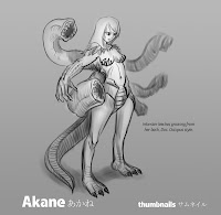
For the villain, I chose Akane, a character that also appears in the same level as Johnny. It was an easier task channeling Hyung Tae-Kim with female characters. I wanted to try something different for the splash page, so I drew the scene where Akane kills Johnny. Multi-figure composition has always been a weakness of mine. I have difficulty trying to portray characters existing within the same space in a drawing; they often turn out looking like separate elements.


Click for transformation animation

Next came the transformation sequence. We were allowed to work on the previous characters that we have already designed, but I chose to do a new one as I got pretty tired of Johnny and Akane after working so long on them. I picked Long Po, a spunky dragonboat racer from Hong Kong. For the transformation sequence, I tried to incorporate knowledge gained from traditional effects animation from last semester to create a Hyung Tae-Kim styled water splash.


The final assignment was a group animation. We managed to persuade our lecturer to allow us to form a massive group consisting of the entire class (7 members). I will further discuss this group project on a separate post, but the above are some of the digital artwork that was churned out as part of the deliverables. The creature is designed by my teammate Lauren Heng.  I left the creature splash page in the school's server, will update this post once I get my hands on it.

[EDIT] - Its here!